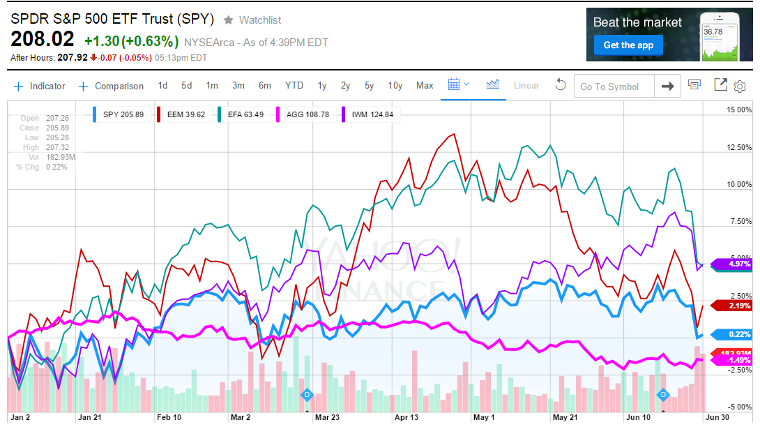
In this week’s post I thought you might like to see a chart that I put together showing a number of market indexes and how they have done so far in 2015 (YTD) that I made on Yahoo Finance. You can see the chart below.
Many people, who have heard on the news ( more than once this year) that the stock market (NASDAQ, Russell 2000 and the S&P 500) made a new all-time high, are going to be surprised to see that the S&P 500 (light blue) is only up 0.22% in the first six months of the year. There are a few areas of investor concerns have put the brakes on US large stocks such as the strong US dollar , the prospect of the FED raising interest rates and the fall in oil prices.
Most people’s portfolios are heavily invested in the large cap US stocks (S&P 500) so that is has been a drag on returns. The second largest weighting in a typical American portfolio is US bonds. The US bond index (AGG) shown in pink is down -1.49% for the YTD — falling from a positive 3% at its peak in January.
In a combined 60%/40% US stock/bond portfolio, index investors would have experienced a negative -.464% loss for the YTD 2015 period. So basically, most US investors are moving sideways but with lots of volatility (many 2-3% swings – both up and down so far this year!)
On the bright side, the international stock index (ex-US) (EFA) in green had the best year to date performance of +4.91% —- despite a drop of about 8% in the last few weeks of the first half.
The Emerging Market Stock index (EEM) which are countries like China, India, Brasil, Mexico, etc. was up 2.19% through June 30.
The Russell 2000 (US small cap companies shown in purple has been the best US index on the chart – rising +4.97% so far this year. Small companies, for the most part, do little business overseas, so the stronger dollar doesn’t hurt their earning as much as the average large cap stock.
Hopefully the second half will be much better than the first. But no matter where we end up for 2015, I can assure the heavy volatility is here to stay.
all the best… Mark

